A health food company saving the planet with crickets
Hop is on a mission to revolutionize the way you think about protein, 1 cricket at a time. They believe in a future where delicious, sustainable, and wholesome nutrition all go hand-in-hand.
Fed up with the lack of high quality, nutrient dense protein options on the market, and concerned about the future of our global food supply, the Hop vision was born out of a passion for making a positive change to the trajectory of our planet. Hop products are the embodiment of that vision. With HOP, you’re not just nourishing your body; you’re nurturing the planet.
Client
Hop
Year
2020
What I did
Logo + Brand Design
Photography Art Direction
Brand Strategy
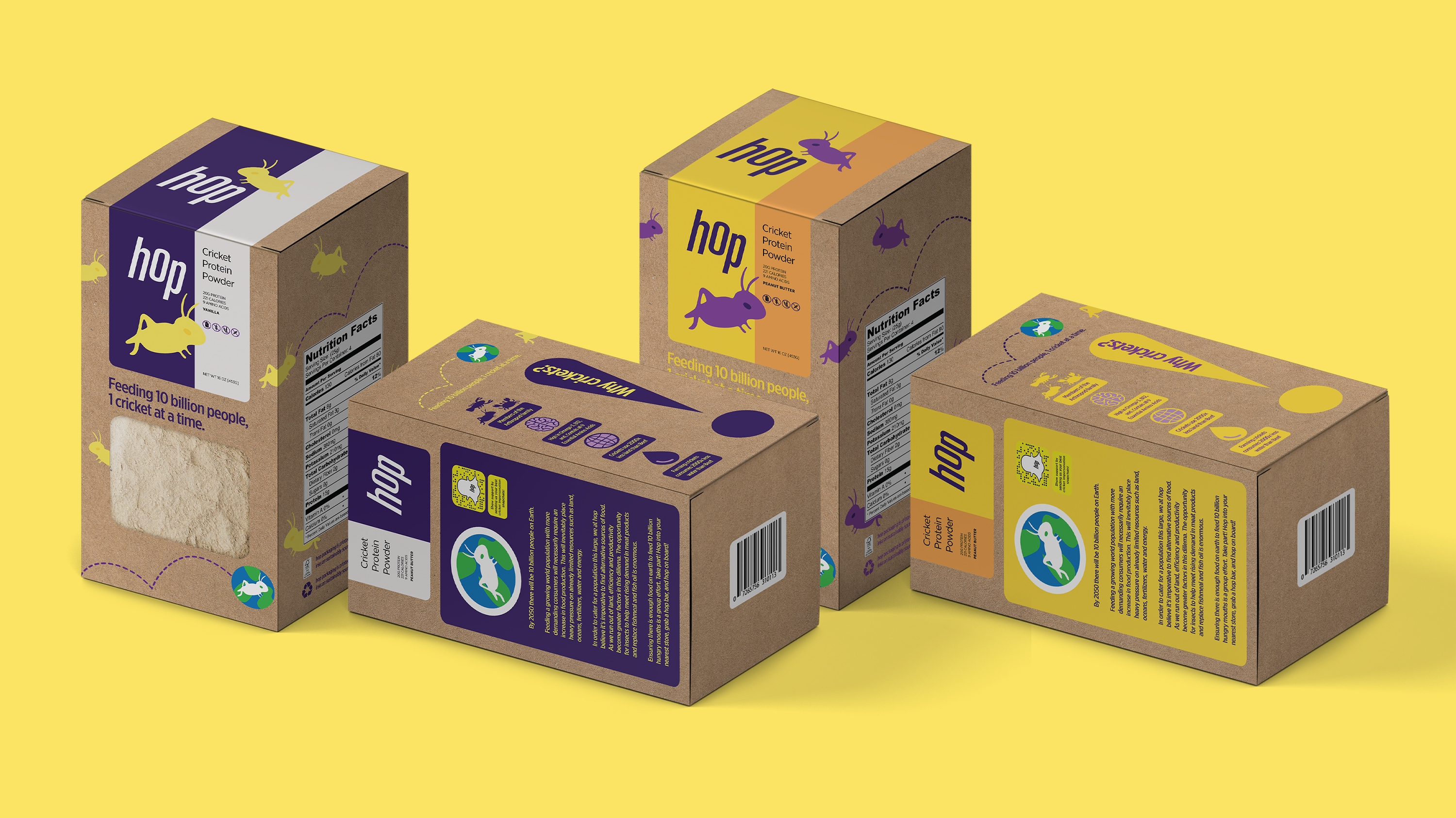
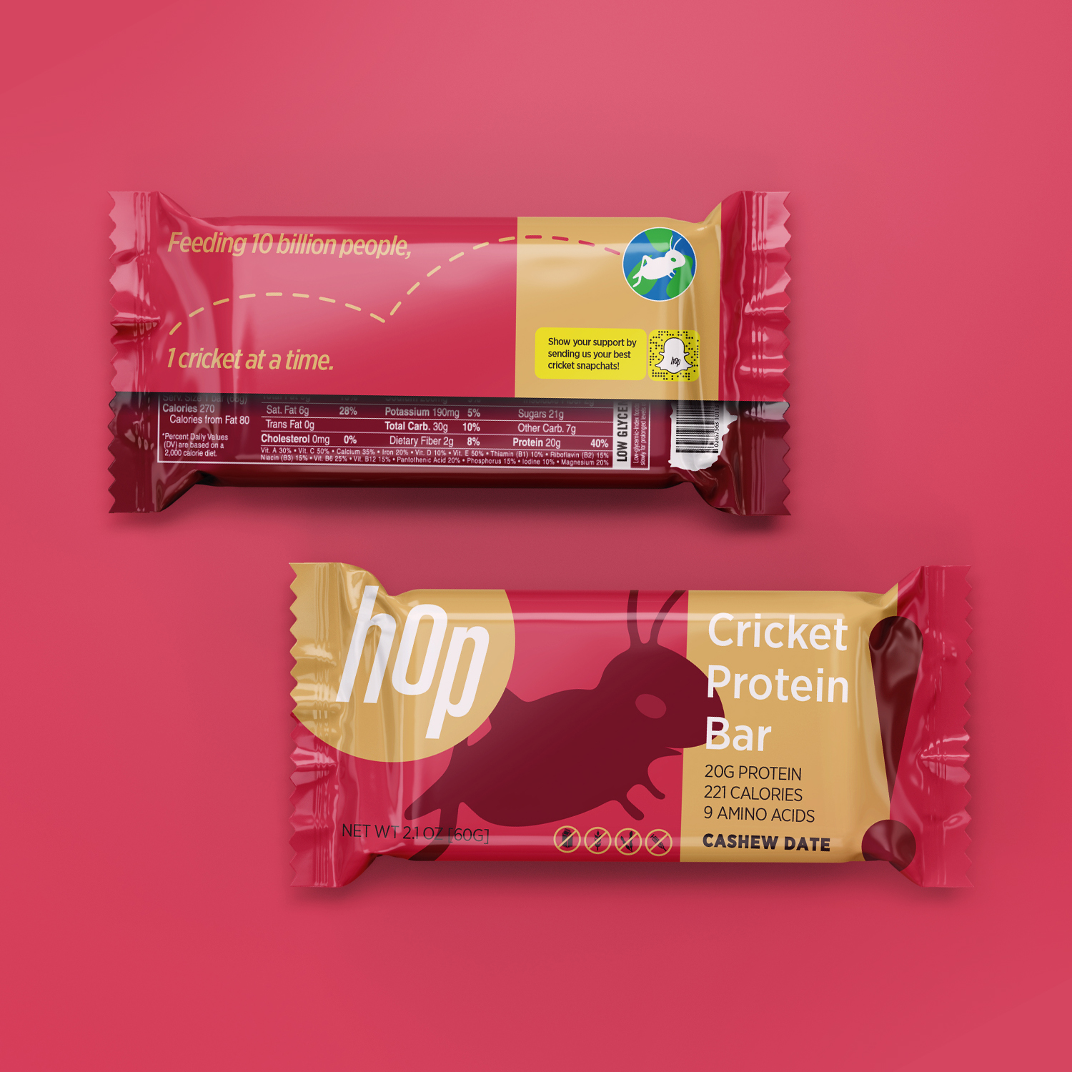
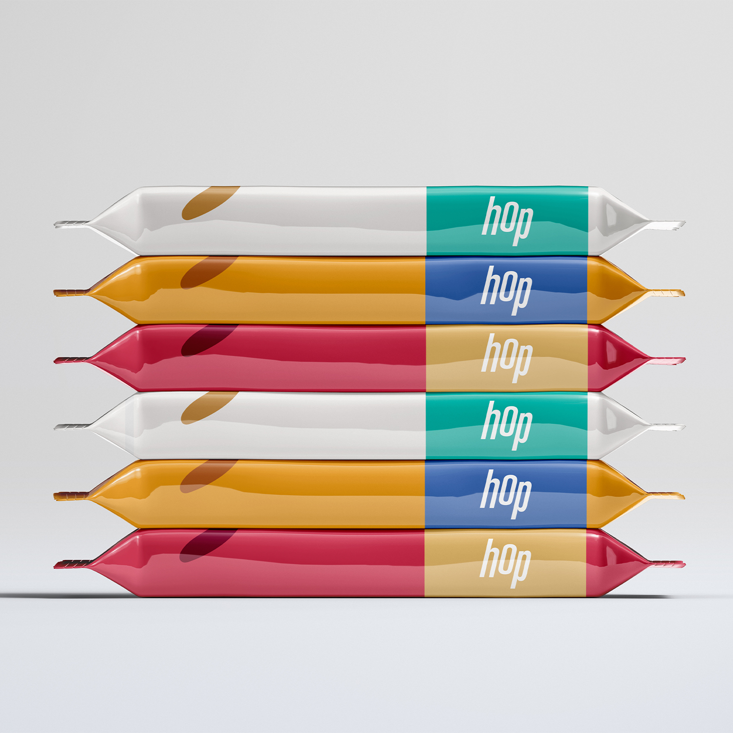
Packaging Design
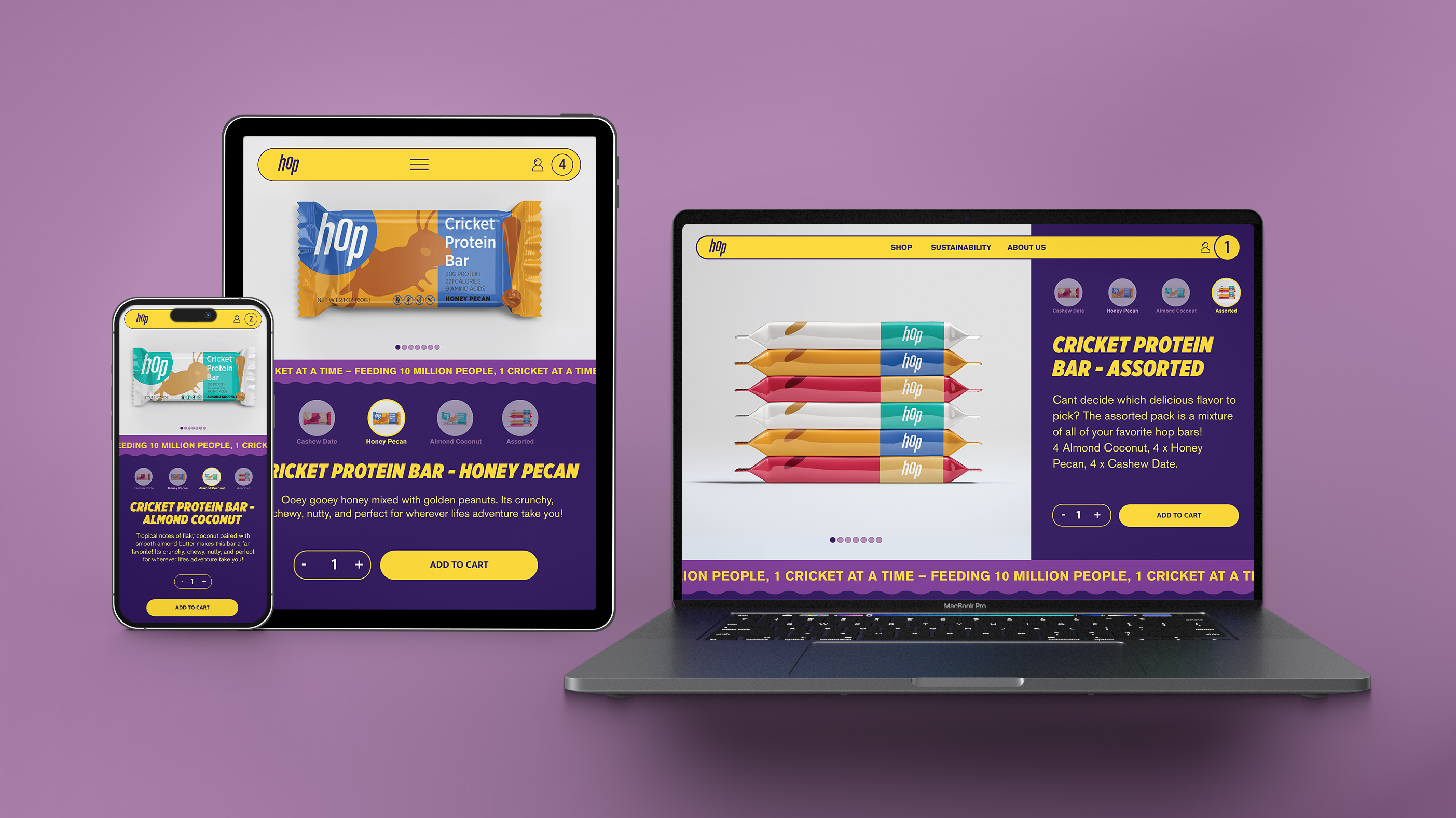
Website Design
Motion Design


THE CHALLENGE
By 2050 there will be 10 billion people on Earth.
Ensuring there is enough food on earth to feed 10 billion hungry mouths is a group effort.
Feeding a growing world population with more demanding consumers will necessarily require an increase in food production. This will inevitably place heavy pressure on already limited resources such as land, oceans, fertilizers, water and energy.
In order to cater for a population this large, it’s imperative to find alternative sources of food. As we run out of land, efficiency and productivity become greater factors in this dilemma.
THE APPROACH
Create a health food company that's a catalyst for positive change on our planet.
Brand Strategy – Crickets
In the Last 30 years obesity has nearly tripled in American adults. This increase in obesity parallels the increased consumption of processed foods. Today, it is estimated that 60% of the calories that Americans consume come from “ultra-processed, low nutrient dense food sources”.
The biggest threat to human life is no longer impending wars, plagues, or epidemics. It is non-communicable diseases. Diet related diseases are now the leading cause of death globally.
Cricket’s are nature’s ultimate protein powerhouse – a complete protein source, containing all essential amino acids, high in healthy fats, and vitamins and minerals. In addition, the overall sustainability benefits of cricket farming are immense – reduced water and land use, lower greenhouse gas emissions, efficient feed conversion, and reduced pressure on arable land.
By incorporating crickets into the food system, Hop can enhance food security, make more efficient use of limited resources, and ensure a more stable and resilient supply of protein for the growing global population. The opportunity for crickets to help meet rising food security concerns is enormous.
Logotype
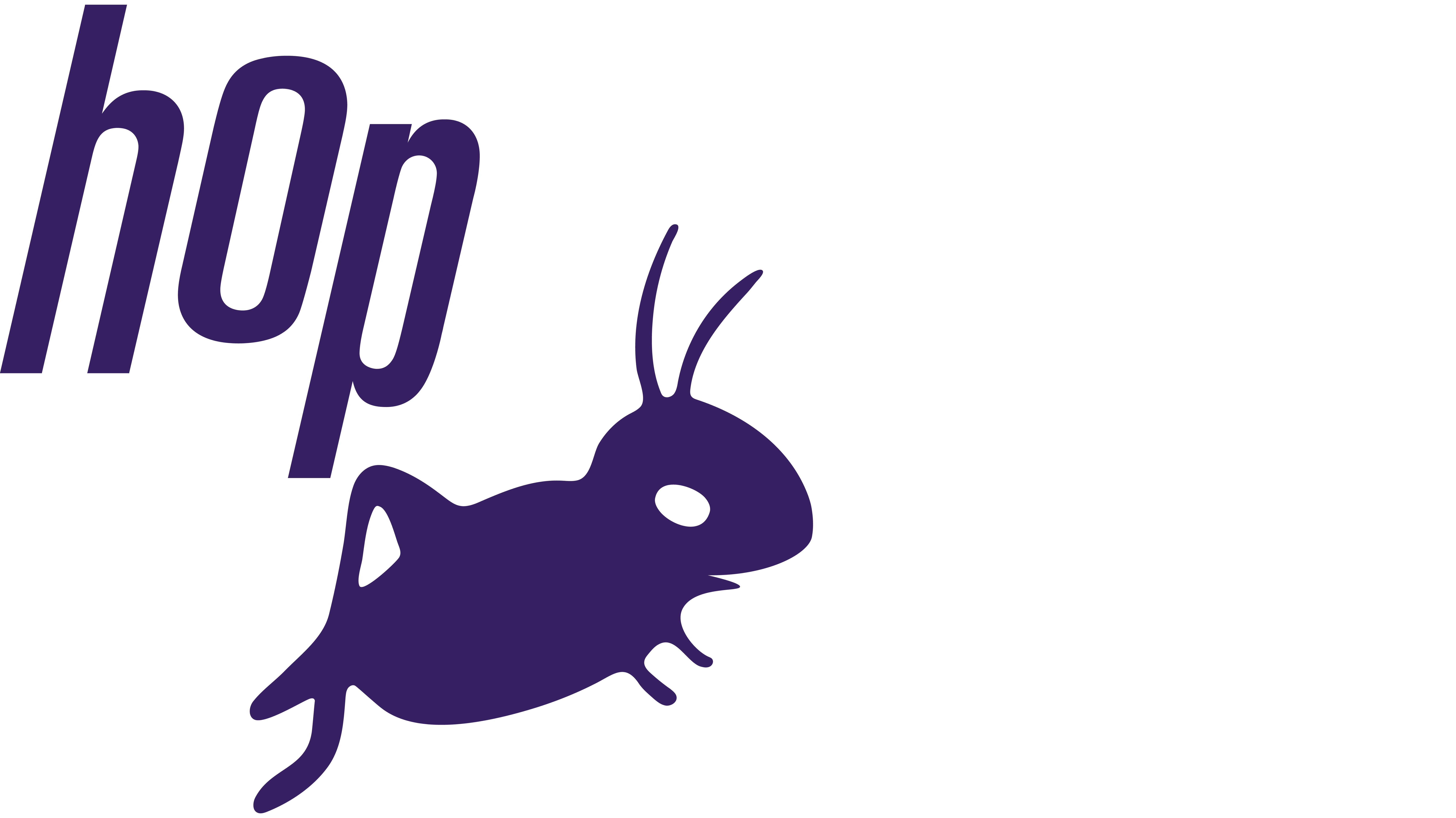
Just like crickets, the hop logotype is designed to hop. This is achieved using color, typography, and the interaction between the letterforms.
The logotype incorporates an italic font to suggest movement. Both the letter O and the letter P have been moved along the Y axis to create a more dynamic form. The combination of these two elements creates a logotype that depicts the motion of a hopping cricket.
Logo
If the hop logotype embodies the spirit of a cricket, the hop cricket embodies the spirit of hop. It is friendly. It is happy. It is forward facing and forward thinking.
The utilization of this logo is part of an initiative to de-stigmatize crickets. Traditional thought depicts crickets as something that is disgusting and scary. The hop cricket goes against these stereotypes, and its prolific use helps to desensitize consumers.
Smooth, organic lines and a welcoming smile were used to accentuate the friendly nature of the hop cricket.
5th Element Graphics
Integrating illustration into the key elements of design, can define a brand’s identity just as much as the logo, font, and colors.
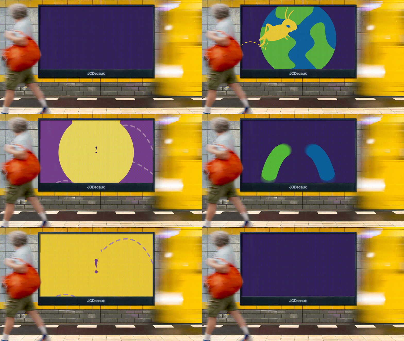
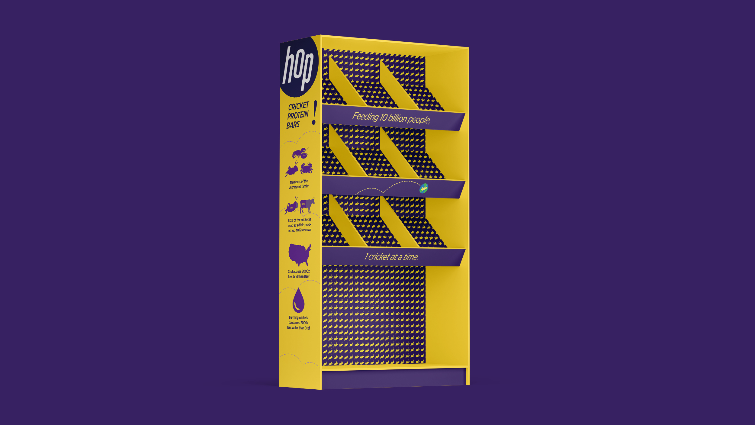
The fifth element graphics of hop do just that. The dashed line insinuates the motion of hopping. This line is used throughout the branding of hop and its products to depict dynamic movement across the canvas.
The exclamation mark is used in two ways: to emphasize and call attention, and to further emphasize dynamic elements of movement. It is used in pairing with facts, figures, information, or other forms of suggested movement.
Color Palette
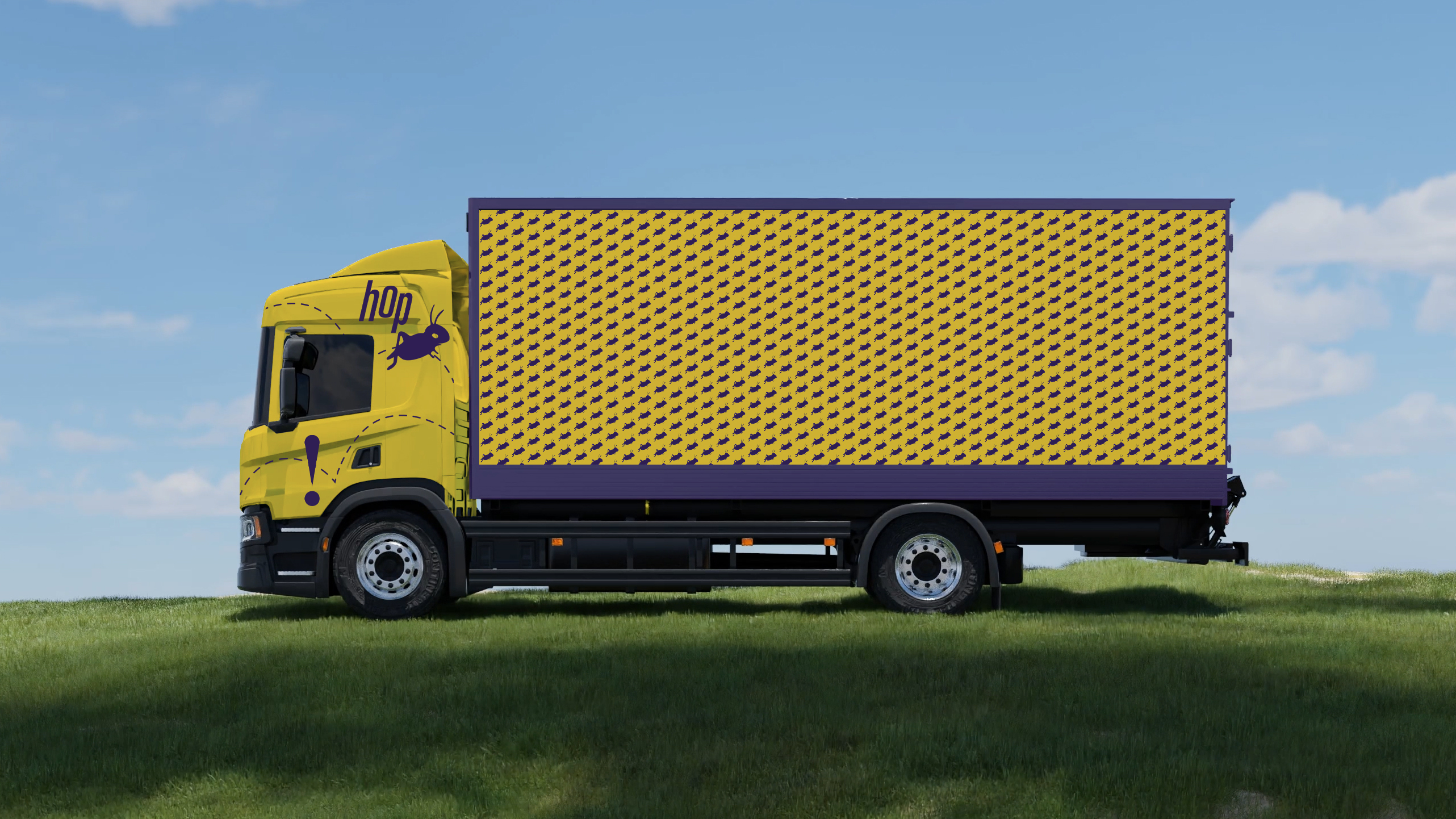
A complimentary color palette or Purple’s and Yellow’s was chosen to emphasize contrast in Hop branding. This causes tension between the foreground and background, which makes the flat canvas hop out towards the viewer.
Tagline
The tagline at hop is specific to the mission statement. By 2050, there will be 10 billion people on earth. The mission of hop is to feed these people in a sustainable, thoughtful way. This will be done 1 Cricket at a time.
‘Feeding 10 billion people, 1 Cricket at a Time.’
Motion Design
The hop brand utilizes motion design elements to further emphasize dynamic elements of movement.

THE RESULT
A cricket protein company, thoughtful and sustainable at every level of the brand.
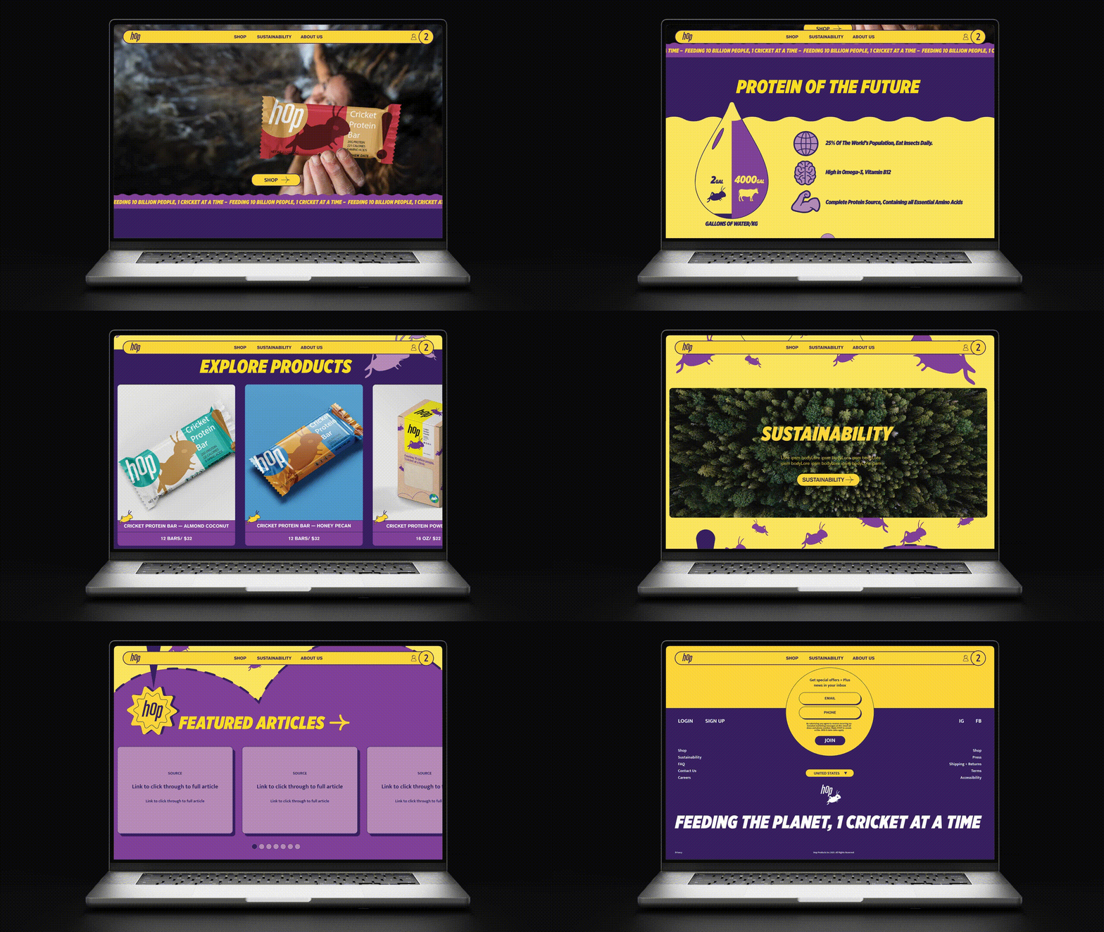
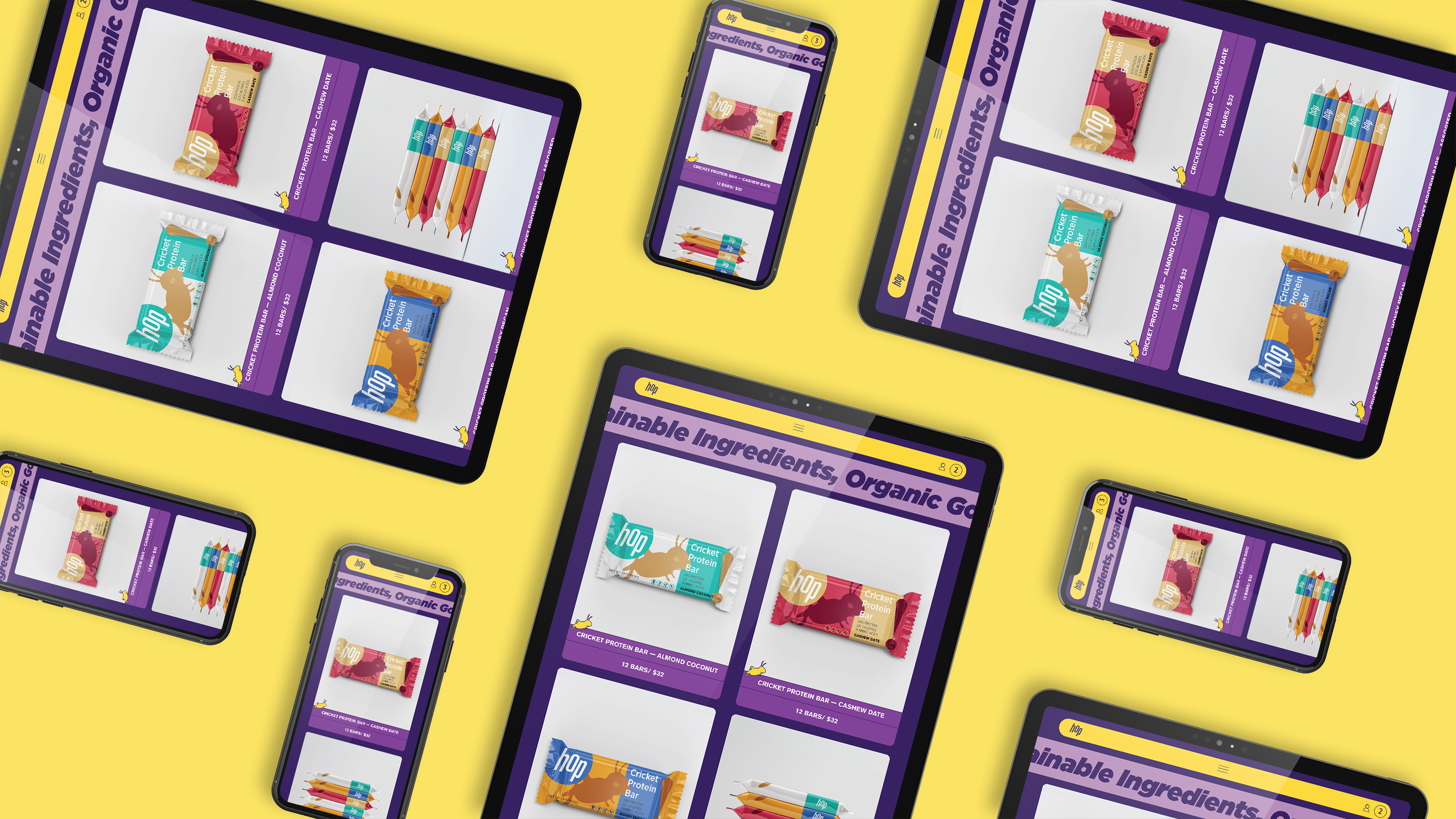
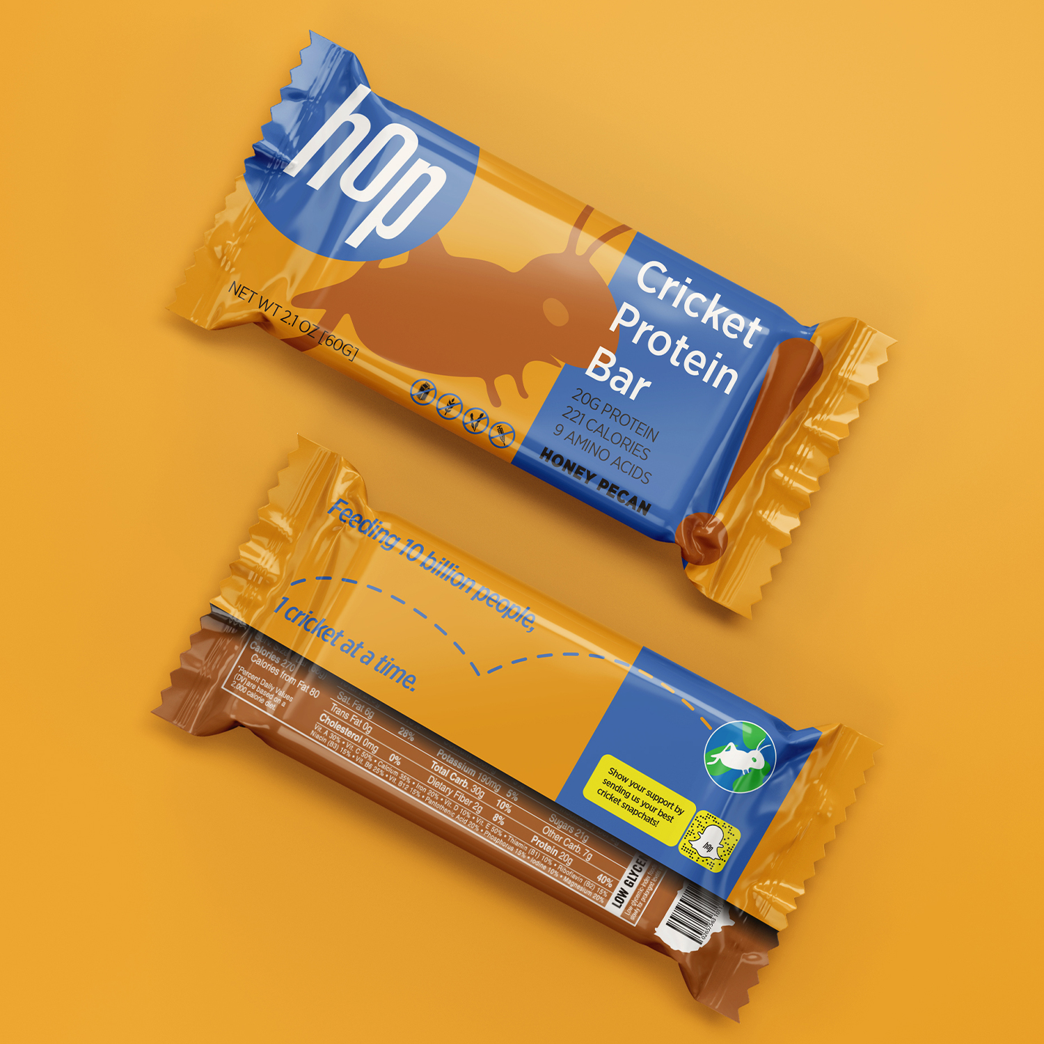
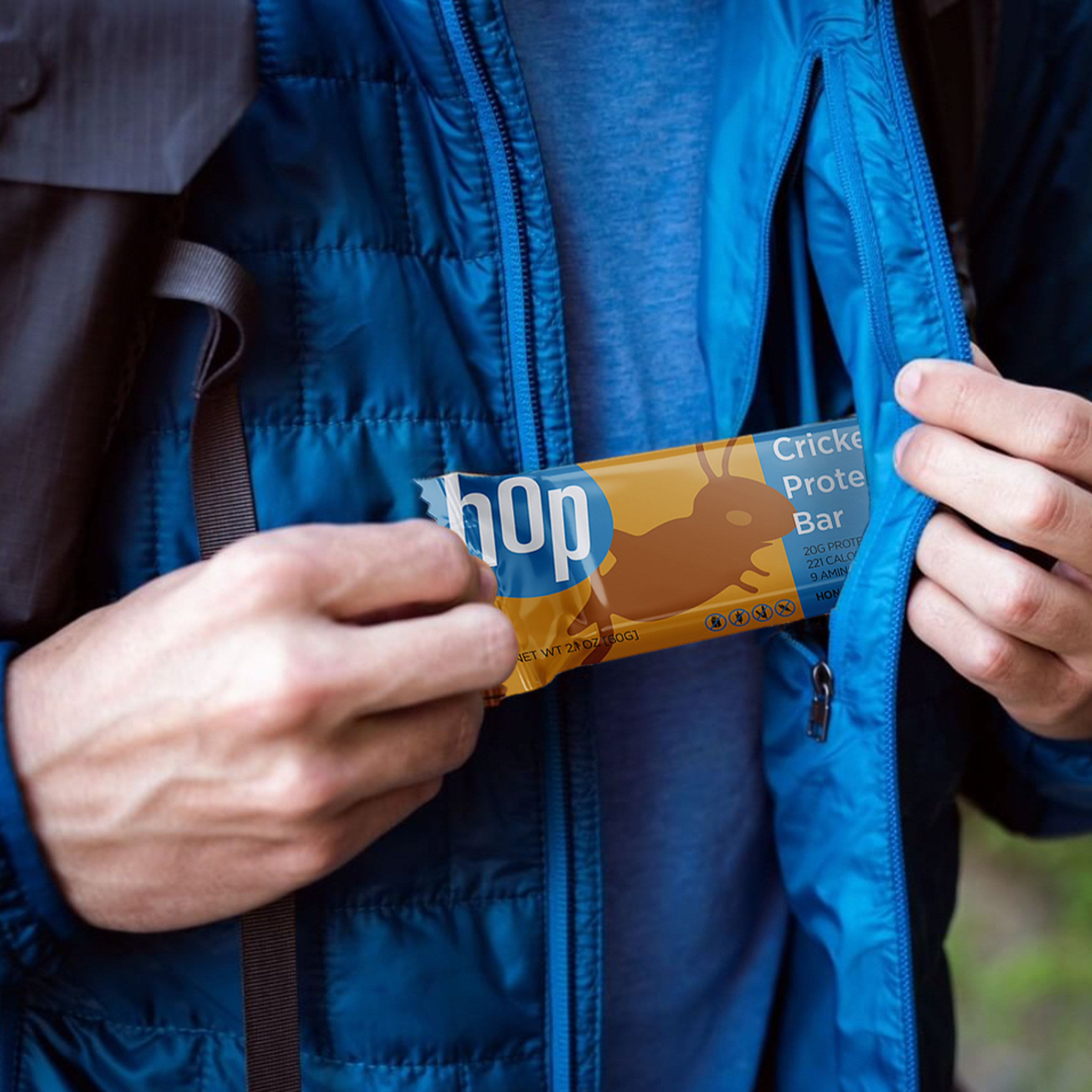
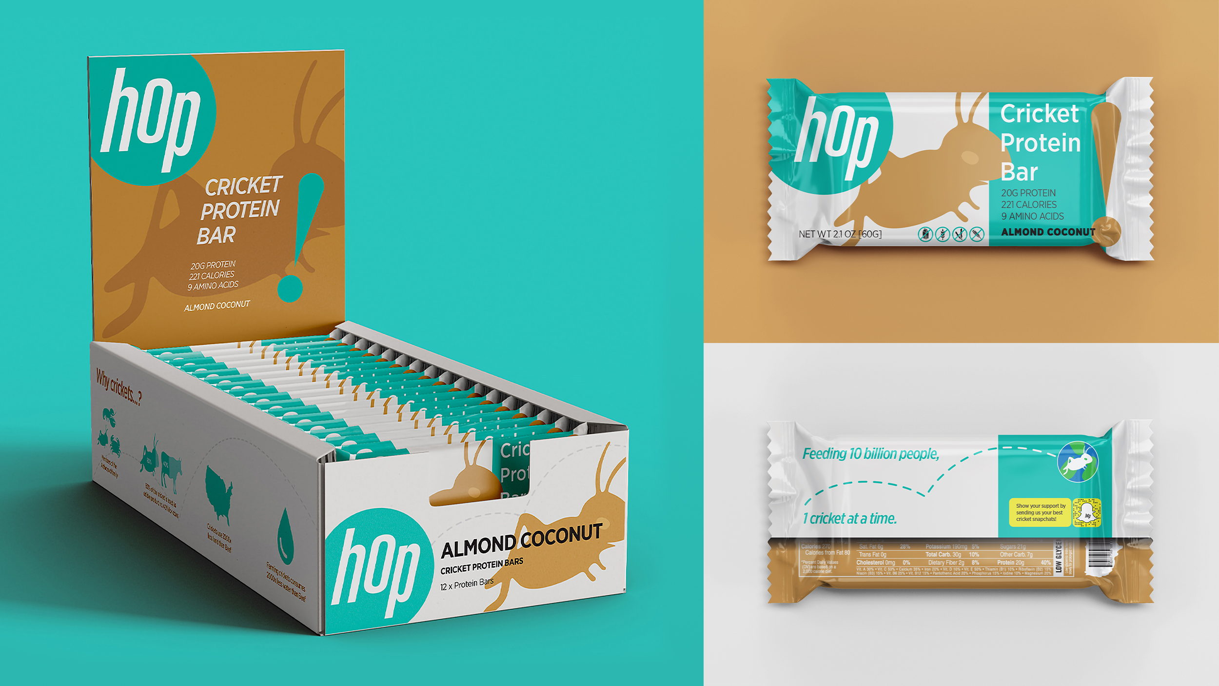
My work with Hop resulted in a striking and playful brand identity that literally hops out at the viewer and could be used to transmit their vision to global markets. I also designed a website, product packaging, as well as posters, motion graphics and other marketing collateral.
Opportunity
The biggest obstacle for Hop while bringing cricket products to the market is the consumer’s preconceived stigma about eating insects. Although consumed globally, Crickets are not naturally seen as a desirable food source in western culture. I worked with the team at Hop to create an advertising/branding strategy that would break down this stigma and normalize cricket consumption.
Advertising Strategy
Although consumed globally, Crickets are not naturally seen as a desirable food source in western culture.
Would you eat crickets? Through qualitative user research, I discovered something interesting. The population of people surveyed who answered No, often followed their answer with a simple statement that would shape my vision for Hop’s brand strategy.
“No, why would I eat crickets, no-one eats crickets.”
Besides their initial disgust at the thought of consuming insects, their questioning of whether other people ate crickets led me to believe that perhaps a lack of awareness or lack of education about the growing consumption of insects could be leading to their stigma.
For this reason, the main focus of hop’s advertising/branding strategy is to change this stigma and normalize cricket consumption. This is a process we at hop like to call: ‘Operation Stigma Death’.
Operation Stigma Death
For this campaign, I propose a solution that utilizes the social media app Snapchat, to highlight the fact that people already consume crickets. Ultimately, this will help to bridge the gap between those who are open and willing to consume crickets, and those who are on the fence, or don’t think others would take part. By seeing other people accepting crickets, it becomes trendy, and people on the fence are influenced to try crickets too!
People are encouraged by hop to engage with their snapchats and create their own unique artworks. This project links art and social media to subtly reposition eating crickets as acceptable by showing that there is already support for them, and that people do in fact eat crickets already, as opposed to a lot of widely held beliefs in western culture.